Address
304 North Cardinal
St. Dorchester Center, MA 02124
Work Hours
Monday to Friday: 7AM - 7PM
Weekend: 10AM - 5PM
Address
304 North Cardinal
St. Dorchester Center, MA 02124
Work Hours
Monday to Friday: 7AM - 7PM
Weekend: 10AM - 5PM
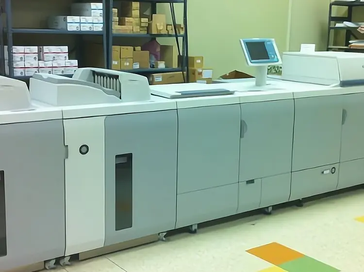
A brilliant design on a computer screen is only a concept. It becomes a product only when it is successfully printed. However, many designers create beautiful visuals without considering the limitations of the manufacturing process, leading to costly errors or disappointing results.
To bridge the gap between “artwork” and “product,” designers must master the four pillars of pre-press design. This guide explores the specific requirements for different printing methods and how to optimize materials, colors, and layouts for industrial production.
Each printing technology has unique characteristics. Designing for one is not the same as designing for another.
This is the most common method for paper products. Designers generally know this well, but key checks are vital:
Common for flexible packaging (e.g., milk films, snack bags).
If you are moving a design from Offset to Flexo, you cannot simply copy-paste.
Known for thick ink layers and vibrant colors.
The choice of material dictates the cost and the final look.
You can learn more about choosing the right paper in our guide to paper selection.
The Purple Problem: Avoid using Cyan + Magenta to create purple, as it often prints “muddy.” Use a spot color (Pantone) or a specific bright pink ink if a vibrant purple is needed.
Resolution Rules:
Sending a 400 DPI file for a newspaper ad is not “better quality”—it often results in a muddier print due to dot gain.
How you arrange the design on the press sheet affects efficiency and waste.
A great designer thinks like a printer. By understanding these four pillars, you can design products that are not only visually stunning but also cost-effective and easy to manufacture.
Need a technical review of your design before going to press? Contact our pre-press team for a consultation.