Address
304 North Cardinal
St. Dorchester Center, MA 02124
Work Hours
Monday to Friday: 7AM - 7PM
Weekend: 10AM - 5PM
Address
304 North Cardinal
St. Dorchester Center, MA 02124
Work Hours
Monday to Friday: 7AM - 7PM
Weekend: 10AM - 5PM
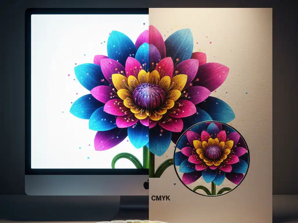
“But it looked brighter on my computer!”
This is the most common reaction we hear during the proofing process. You design a vibrant blue brochure on your monitor, but the printed sample comes out looking slightly darker or less saturated. It’s frustrating, but it’s not a mistake. It’s physics.
Understanding why this happens is the key to getting the results you want. Here is the definitive explanation of the difference between screen colors, digital proofs, and the final offset print.
The biggest culprit is the difference in color modes.
The Reality Gap: The RGB spectrum is much wider than CMYK. There are colors your screen can display (like electric blue or neon green) that simply cannot be reproduced with physical ink. When you print an RGB file, the machine forces those “out-of-gamut” colors into the closest possible CMYK match, which often looks duller.
Even if you and I look at the exact same file, we might see different colors. Why?
Because of this, a computer screen is never a 100% reliable reference for color accuracy.
Ink doesn’t sit on paper; it interacts with it.
The same digital file will look completely different on these two stocks. You can learn more about this in our guide to paper selection.
Digital printing technology has advanced incredibly, and today’s digital proofs are very close to the final result. However, they are simulated. A digital printer uses toner or inkjet technology, while a traditional press uses wet ink and plates. Slight variations in texture and gloss are normal.
Since you can’t trust the screen, what can you trust?
Trust the Numbers (The Color Chart).
For critical brand colors (like your logo), never rely on visual estimation. Use a standard physical color book (like a Pantone bridge guide or a CMYK process guide). When you tell us “I want Pantone 300C” or “C:100 M:50 Y:0 K:0,” we know exactly what that looks like, regardless of what the screen shows.
Worried about a complex color job? Request a physical wet-proof consultation before your next big run.