Address
304 North Cardinal
St. Dorchester Center, MA 02124
Work Hours
Monday to Friday: 7AM - 7PM
Weekend: 10AM - 5PM
Address
304 North Cardinal
St. Dorchester Center, MA 02124
Work Hours
Monday to Friday: 7AM - 7PM
Weekend: 10AM - 5PM
Choosing the right tools is the first step. We recommend industry-standard software such as Adobe InDesign (best for layout), Adobe Illustrator (for vectors), and Adobe Photoshop (for image editing). These programs ensure your files are compatible with professional printing machinery.
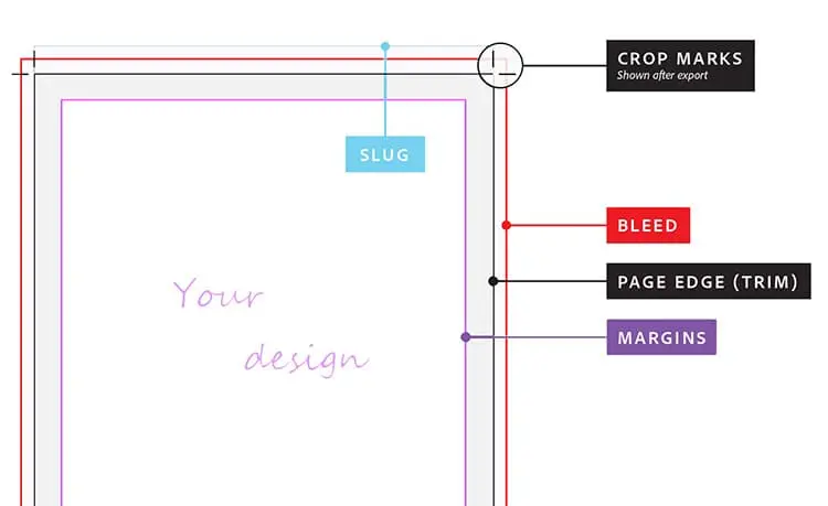
Bleed is the margin around the edge of the page that will be trimmed off during production. You must extend your background artwork into this bleed area (standard size is 0.125 inches / 3mm) to ensure there are no ugly white strips on the edges of your final book.
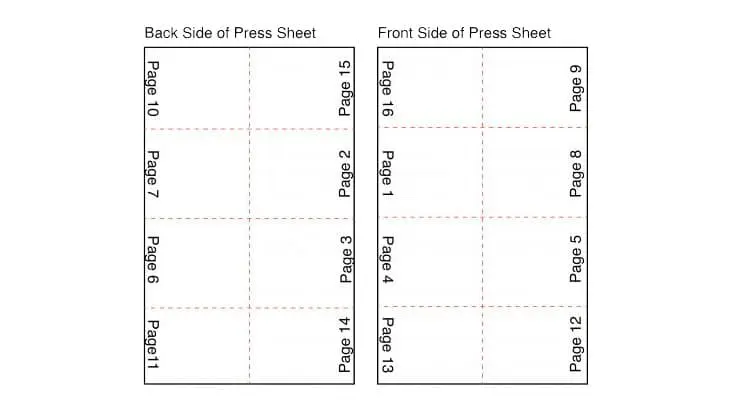
A signature is a group of pages printed on a single large sheet of paper, which is then folded and trimmed. Understanding signatures (usually in multiples of 4, 8, 16, or 32) helps you plan your page count efficiently for offset printing.

CMYK and RGB are distinct color modes. RGB is used for digital screens (creating colors with light), while CMYK is used for printing (creating colors with ink). Why it matters: We strongly recommend designing in CMYK. If you submit RGB files, we must convert them to CMYK for printing, which can result in duller colors. To guarantee the print matches your vision, set your document to CMYK from the start.
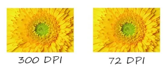
Resolution determines image sharpness. While 72 DPI looks fine on a computer screen, it will look pixelated and blurry in print. Always ensure your images are High Resolution (at least 300 DPI) at the final print size for a crisp, professional look.
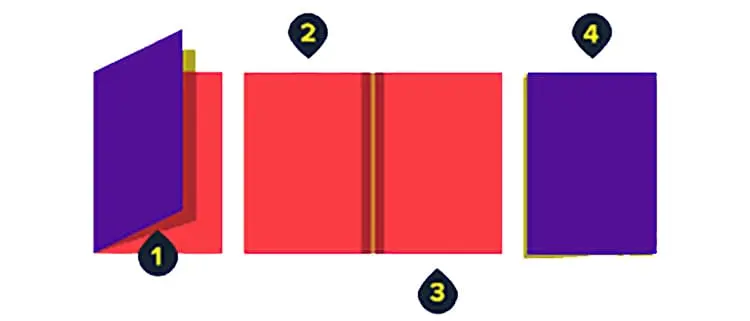
Including the spine in your cover design is vital for a professional look. Be sure to include the book title and author’s name. Note: Do not guess the spine width! The size depends entirely on your page count and paper thickness. Contact Kore Create Inc for a precise template.
Don't forget the basics. Page numbers help readers navigate your content and add a level of professionalism. From a production standpoint, they also help ensure the bindery arranges your pages in the correct order during assembly.

Vector graphics (created in Illustrator) are mathematical calculations, not pixels. This means they can be scaled up or down infinitely without losing quality. Using vectors for text and logos ensures they remain razor-sharp in the final print.
For the final hand-off, High-Quality PDF is the industry gold standard. Adobe InDesign allows you to export print-ready PDFs that lock in your fonts and images, ensuring what you see is what you get.
