Address
304 North Cardinal
St. Dorchester Center, MA 02124
Work Hours
Monday to Friday: 7AM - 7PM
Weekend: 10AM - 5PM
Address
304 North Cardinal
St. Dorchester Center, MA 02124
Work Hours
Monday to Friday: 7AM - 7PM
Weekend: 10AM - 5PM
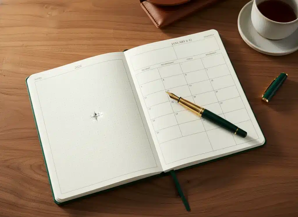
In 2026, the stationery market is experiencing a “Paper Rebellion.” While Pantone announced “Cloud Dancer” (a soft, airy white) as the Color of the Year, the planner community has moved in a different direction—demanding richer, decadent tones and, more importantly, uncompromising paper quality.
For years, the focus of custom notebook manufacturing was the cover—leather textures, foil stamping, and rigid boxes. But as we move deeper into 2026, the battleground has shifted to the interior. The “Hobonichi Paper Crisis” of late 2025, where loyal users reported unprecedented bleeding and ghosting with the new Sanzen Tomoe River paper, served as a wake-up call for the industry. It proved that even the most legendary brands are not immune to supply chain quality dips.
For brands and businesses looking to manufacture custom planners this year, the message is clear: It is what is inside that counts.
This guide is a deep dive into the technical specifications of custom notebook inner pages, from the geometry of dot grids to the chemistry of ink opacity.
The era of standard “College Rule” (7.1mm) being the default is over. Modern users, driven by the resurgence of analog productivity in a digital world, require layouts that adapt to their cognitive styles.

The dot grid is no longer a niche format for bullet journalists; it is the industry standard for flexible planning. However, the execution of the dot grid in 2026 has become a precise science.
The 5mm Standard vs. The 4mm Contender
For the last decade, 5mm spacing (approx. 0.2 inches) was the golden rule. It aligns perfectly with the metric system and accommodates most handwriting sizes. However, as A6 and “Weeks” size planners gain popularity for their portability, 5mm can feel too sparse.
In 2026, we are seeing a significant rise in 4mm dot grid requests for pocket-sized notebooks. This tighter mesh allows for more data density on smaller pages. Conversely, 3.5mm grids remain a niche product, mostly used by artists requiring high-precision guidance for architectural sketching.
Dot Opacity and Color
The color of the dots is just as critical as their spacing. If the dots are too dark (black or dark grey), they distract from the content. If they are too light, they become useless under warm indoor lighting.
Designing a custom planner layout in 2026 requires understanding “Time Blindness” and the modern worker’s need for structure. The “Spiral Daily Simplified Planner” model has set a high bar, combining durability with hourly blocking.
1. The “Week on 2 Pages” (Vertical vs. Horizontal)
2. Hybrid Digital-Analog Integration
Static pages are becoming dynamic. Advanced Variable Data Printing (VDP) now allows for the inclusion of unique QR codes on weekly spreads.
3. Wellness and “Junk Journal” Spaces
Modern layouts are less rigid. We are seeing “white space” intentionally designed into margins. This isn’t wasted space; it is designated real estate for the “beautifully messy” aesthetic—torn ticket stubs, photos, and stickers that users paste in to document their lives.

If there is one technical specification that defines a premium notebook in 2026, it is the paper quality. The “GSM” (Grams per Square Meter) number is often used as a marketing shorthand for quality, but it is only half the story.
The GSM Hierarchy
Coating and Tooth
GSM measures weight, not ink resistance. A 100gsm uncoated sheet will bleed more than a 52gsm coated sheet.
The “Cloud Dancer” vs. Cream Debate
While Pantone’s 2026 “Cloud Dancer” white is trending in fashion, high-end planners often stick to Soft Cream or Ivory. Pure white paper causes higher eye strain under office fluorescent lighting. A soft cream (approx. 85-90% brightness) reduces glare and provides a perceived sense of luxury.
Kore Create’s Approach
In response to the market’s demand for consistency, Kore Create recommends a 120gsm Uncoated Premium Offset paper for custom planner projects. This stock offers the perfect balance: substantial enough to feel luxurious and opaque enough to handle double-sided printing of heavy black ink layouts, yet porous enough to allow for quick drying during rapid note-taking.
The custom planner market of 2026 is defined by a return to quality. Users have been burned by mass-market inconsistencies and are seeking reliable, well-engineered tools that respect their time and their ink.
Whether you are designing a minimalist 4mm dot grid for architects or a 120gsm daily planner for executives, the success of the product lies in the details of the inner pages. It is no longer enough to just put a logo on the cover; the writing experience must be flawless.
At Kore Create, we specialize in navigating these technical nuances, ensuring that your custom notebook is not just a product, but a precision tool for the year ahead.