Address
304 North Cardinal
St. Dorchester Center, MA 02124
Work Hours
Monday to Friday: 7AM - 7PM
Weekend: 10AM - 5PM
Address
304 North Cardinal
St. Dorchester Center, MA 02124
Work Hours
Monday to Friday: 7AM - 7PM
Weekend: 10AM - 5PM
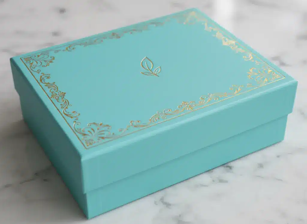
Why is a specific shade of robin’s-egg blue immediately recognizable as Tiffany & Co.? Why does a bright red box trigger an instant association with Coca-Cola or Nintendo? The answer lies in packaging color psychology.
For early-stage brands still in the “sketching” phase of their identity, choosing a color palette isn’t just an aesthetic choice—it’s a strategic one. Before a customer reads your logo or touches your product, their brain has already formed an opinion based on the hues they see. At Kore Create, we help brands navigate these psychological triggers to ensure their first physical touchpoint—the packaging—tells the right story.
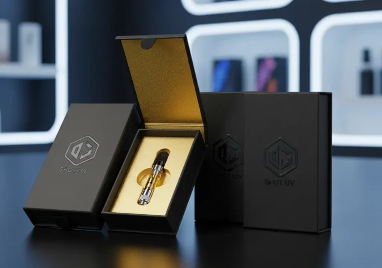
When it comes to high-end positioning, the industry has a “secret code.” Black and gold remain the undisputed champions of the premium market.
Black symbolizes authority, power, and mystery. When paired with metallic gold or silver foils, it creates a high-contrast visual that suggests the product inside is “reserved for the few.” Many high-end brands prefer minimalism here—using vast amounts of “negative space” to let the metallic accents shine.
Luxury packaging design tips:
In the world of skincare, organic supplements, and wellness, the brand color meaning shifts toward transparency and purity.
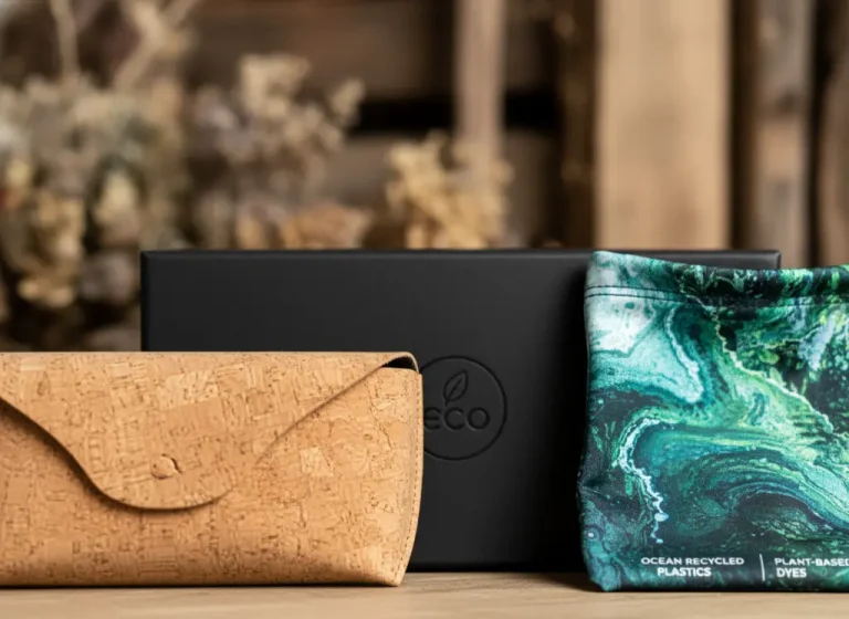
White communicates clarity and efficiency. It tells the customer that the brand has nothing to hide. Kraft paper (natural brown) takes this a step further by signaling eco-consciousness and “raw” authenticity. This is why organic food brands rarely use neon colors; they want to mimic the colors found in nature.
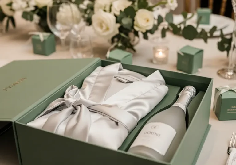
For a modern “clean girl” or “minimalist” brand, a palette of cream, sage green, and sand is the gold standard. It evokes a sense of calm and reliability, which is essential for products that customers apply to their skin or ingest.
If your target audience is Gen Z, the rules of 1990s minimalism no longer apply. This demographic craves “Dopamine Decor”—high-energy visuals that pop on TikTok and Instagram.
Recent trends show a massive shift toward “Sunset Gradients” (warm peaches to deep corals) and holographic finishes. These materials change color depending on how the light hits them, making them inherently “shareable.”
According to recent data, 40% of consumers share photos of packaging on social media if they find it distinct or “cool.” For a startup, this is free marketing. Using holographic foils or neon inks ensures your product doesn’t just sit on a shelf; it demands a photoshoot.

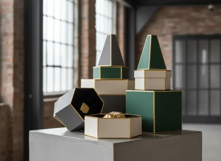
One of the biggest mistakes early-stage brands make is “color drift.” If your Custom Notebooks are a slightly different shade of blue than your shipping boxes, it subtly erodes trust.
At Kore Create, we emphasize the importance of Pantone matching. Because different materials (cardboard, silk, paper, or plastic) absorb ink differently, achieving a 100% match requires technical expertise.

The impact of color on consumer behavior is backed by decades of psychological research:**The 90-Second Rule:
Choosing your brand palette is the first step in building a lasting legacy. Whether you are aiming for the quiet elegance of luxury or the high-energy pulse of a Gen Z startup, your colors are your brand’s most powerful silent salesperson.
At Kore Create, we specialize in turning these psychological concepts into high-quality physical reality. From the perfect Pantone match to the most intricate foil stamping, we ensure your packaging doesn’t just hold your product—it sells it.
Ready to bring your brand vision to life? Contact Kore Create today to discuss your custom packaging and stationery needs.