Address
304 North Cardinal
St. Dorchester Center, MA 02124
Work Hours
Monday to Friday: 7AM - 7PM
Weekend: 10AM - 5PM
Address
304 North Cardinal
St. Dorchester Center, MA 02124
Work Hours
Monday to Friday: 7AM - 7PM
Weekend: 10AM - 5PM
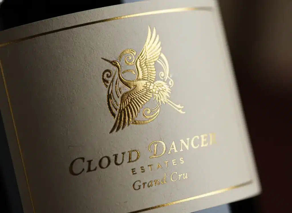
In the competitive landscape of 2026, the wine industry has shifted decisively toward “Quiet Luxury.” As consumers become more discerning, the battle for shelf space is no longer won by the loudest colors, but by the most compelling tactile experiences. Industry data from early 2026 indicates that 70% of purchasing decisions in the premium alcohol sector are influenced by the physical feel of the packaging. The label sells the bottle, and in this era of minimalism, Custom wine labels printing has evolved into a sophisticated art form that blends heritage craftsmanship with cutting-edge material science.
At Kore Create, we have observed a massive pivot away from glossy, flat synthetics toward rich, organic textures that invite the consumer’s touch. Whether it is the adoption of Pantone’s 2026 Color of the Year, “Cloud Dancer”—a soft, serene white—or the integration of smart connectivity, the modern wine label is a multi-sensory gateway to the brand’s story. This guide explores the essential techniques defining luxury labeling this year, from wet-strength papers to high-build digital varnishes.
The prevailing design philosophy for 2026 is “restraint.” The maximalist trends of the early 2020s have given way to clean lines, negative space, and a focus on material quality—a trend often referred to as “Paperization.” Brands are increasingly moving away from plastic-heavy films to bio-based and recycled paper stocks that communicate sustainability without sacrificing elegance.
For Custom wine labels printing, this means the substrate itself is the star. Designers are utilizing the natural grain of the paper to provide a backdrop for minimalist typography. The goal is to create a “haptic” experience; when a customer picks up the bottle, the label should feel distinct from the smooth glass. This tactile contrast signals premium quality instantly. Furthermore, the integration of “Smart Packaging” elements, such as unobtrusive QR codes linked to blockchain traceability or augmented reality stories, is becoming standard. These elements must be printed with absolute precision to function correctly while maintaining the label’s aesthetic integrity.
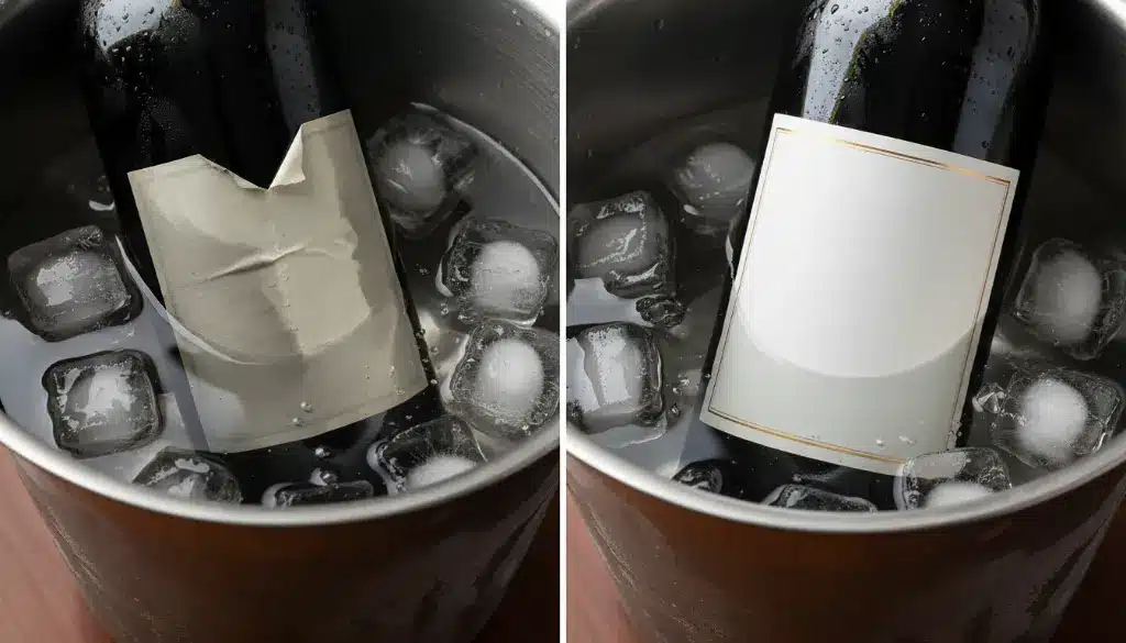
There is nothing more detrimental to a luxury wine brand than a label that disintegrates, bubbles, or slides off the bottle after twenty minutes in an ice bucket. Standard paper stocks are hydrophilic; they absorb water, causing the fibers to swell and the adhesive to fail. This is known in the industry as “label graying” or “bubbling.”
To combat this, 2026 has seen the widespread adoption of advanced Wet Strength papers. These are not just standard papers with a coating; they are engineered at the pulp level.
For white wines, rosés, and sparkling wines that are destined to be chilled, specifying a wet-strength stock is non-negotiable. It ensures that the brand image remains pristine from the first pour to the last drop.
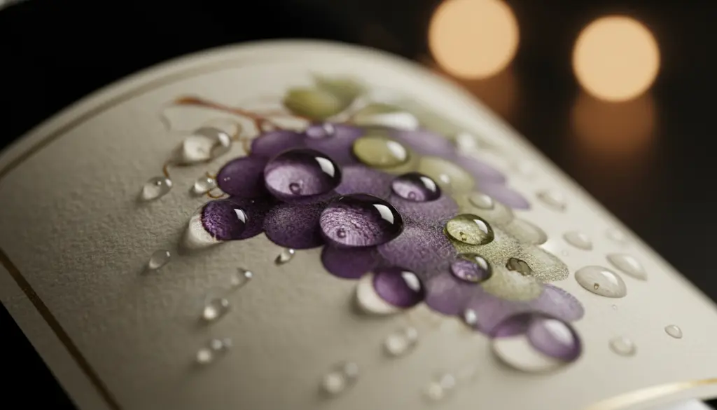
If visual design grabs attention, texture secures the emotional connection. The phrase “Textured label paper” encompasses a variety of finishes that evoke history and craftsmanship. In 2026, the demand for “rough” and “natural” feels has skyrocketed.
Using these textures transforms a flat 2D print into a 3D object. When a consumer runs their fingers over a felt or cotton label, they subconsciously perceive the product as higher value.
Once the paper is selected, the embellishments bring the design to life. Embossed wine labels are a staple of luxury, but new technologies have expanded what is possible.
Sculpted Embossing:
Unlike standard flat embossing, sculpted embossing (or multi-level embossing) uses a die that is carved with varying depths and angles. This allows for intricate details, such as the rounded curve of a grape or the feathers of a bird, to be rendered in 3D relief. It creates a “bas-relief” sculpture effect on the paper.
Digital High-Build Varnish:
For shorter runs or variable designs, digital high-build varnish (often called Spot UV) is the technology of choice in 2026. Inkjet heads deposit layers of clear polymer varnish onto specific areas of the label—such as the logo or a specific pattern.
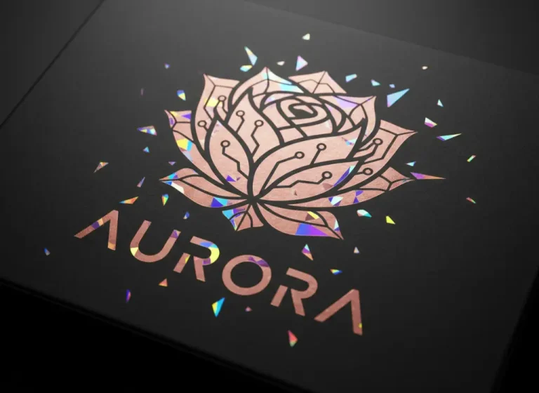
Combining these techniques—for example, a blind embossed background pattern with a high-build glossy logo—creates a complex interplay of light and shadow that is mesmerizing on the shelf.
The final frontier in breaking the mold is the shape of the label itself. The traditional rectangular “sticker” is increasingly being replaced by custom die-cut shapes.
In 2026, we are seeing a trend toward “organic” die cuts. Instead of a straight edge, the top of the label might follow the contour of a mountain range, a vine, or the typography of the brand name.
Advanced die-cutting technology, including laser die-cutting for intricate lace-like patterns, allows Kore Create to produce shapes that were previously impossible with traditional steel rule dies.

In 2026, a wine label is more than just an identifier; it is the primary touchpoint of the brand experience. By leveraging Custom wine labels printing with advanced wet-strength materials, Textured label paper, and Embossed wine labels, wineries can command higher price points and build deeper loyalty.
At Kore Create, we specialize in these high-end print finishing techniques. We understand that in the luxury market, the details are not just details—they are the product. Whether you need a waterproof stock for your crisp Sauvignon Blanc or a velvet-touch cotton label for your reserve Cabernet, our team is ready to engineer the perfect solution.