Address
304 North Cardinal
St. Dorchester Center, MA 02124
Work Hours
Monday to Friday: 7AM - 7PM
Weekend: 10AM - 5PM
Address
304 North Cardinal
St. Dorchester Center, MA 02124
Work Hours
Monday to Friday: 7AM - 7PM
Weekend: 10AM - 5PM
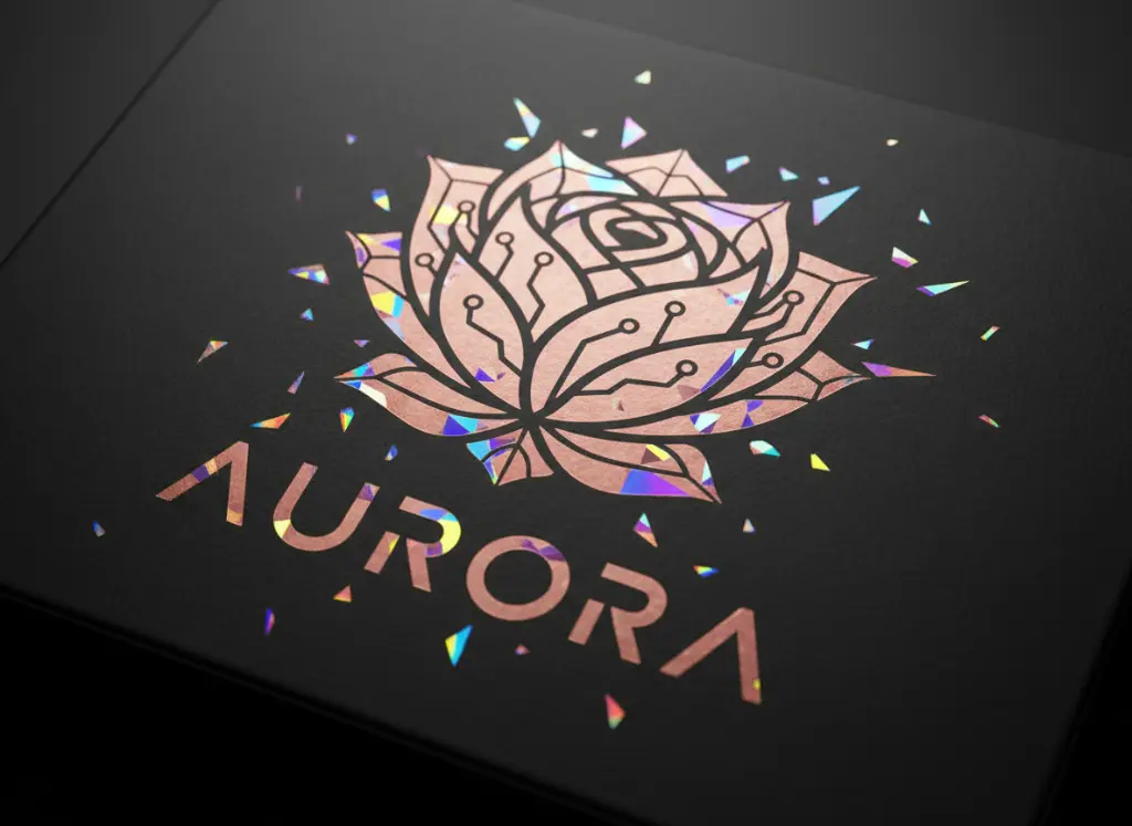
In the competitive landscape of retail, the first physical touchpoint a consumer has with your brand is the packaging. While traditional gold foil has long been the hallmark of luxury, modern manufacturing at Kore Create has expanded the palette. Today, rose gold foil packaging and holographic finishes are no longer “alternative” choices—they are strategic tools used to communicate specific brand values, from modern femininity to futuristic innovation.
Choosing the right foil color requires an understanding of both color psychology and the technical limitations of print finishing. This guide explores how to move beyond the standard yellow gold to create a truly bespoke unboxing experience.
Rose gold foil packaging has transcended its status as a “trend” to become a foundational color in premium design. Often associated with the “Millennial Pink” movement, rose gold offers a warmth that traditional gold and silver lack.
Psychologically, rose gold communicates compassion, composure, and luxury. In the beauty and skincare industry, it mimics skin tones and sunset hues, creating an immediate emotional connection. For tech brands, it provides a “soft” alternative to the cold, industrial feel of silver or chrome.
When designing for rose gold, consider the base material. Because rose gold has a slight copper undertone, it pairs exceptionally well with “nude” palettes, cream-colored stocks, and deep emerald greens. At Kore Create, we often recommend a soft-touch lamination beneath rose gold foil to enhance the tactile contrast between the velvety paper and the metallic shimmer.
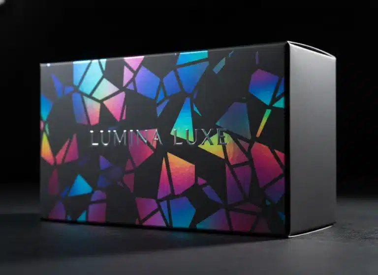
If rose gold is about warmth, holographic foil printing is about energy. Holographic foils use light diffraction to create a rainbow effect that changes as the consumer moves the package.

Market research indicates that younger demographics (Gen Z and Alpha) respond more favorably to “dynamic” packaging. Holographic finishes feel interactive and “Instagrammable,” making them perfect for limited edition drops, streetwear brands, and high-end stickers.
While metallic foils get the most attention, pigment foils (flat colors) are the unsung heroes of the printing world. Unlike traditional offset or digital ink, which can be absorbed by dark or porous paper, pigment foil is a solid layer of dry “paint” transferred via heat.

If you want crisp, bright white text on a deep black or navy box, standard ink will often look grey or translucent. White pigment foil provides 100% opacity, resulting in a sharp, high-contrast finish that is impossible to achieve with standard printing methods. This technique is a staple for Kore Create clients looking for a “monochrome luxury” aesthetic.
Selecting a foil color is more than a decorative choice—it is a brand positioning strategy. Whether you opt for the trendy warmth of rose gold foil packaging, the high-energy shift of holographic foil printing, or the subtle elegance of matte gold, your choice will dictate how your brand is perceived on the shelf.
Ready to elevate your packaging? Contact Kore Create today to see physical samples of these finishes and find the perfect match for your brand identity.