We see it happen too often: A designer spends weeks crafting a beautiful layout, but when the boxes arrive from the printer, the excitement turns to disappointment. The fonts look wrong, the images are dark, or the colors are dull.
The gap between a digital file and a physical product is bridged by technical knowledge. To ensure your design looks as good in hand as it does on screen, here are the three essential areas of printing knowledge you need to master.
1. The Printing File: It All Starts with the PDF
The PDF is the universal language of the printing industry. But not all PDFs are created equal.
- Export Settings: When exporting from InDesign, always choose “Press Quality.” Ensure your Crop Marks and Bleed (usually 3mm) are turned on.
- Single Pages vs. Spreads: This is a critical mistake. Always export your file as Single Pages, not Spreads. Our imposition software needs individual pages to arrange them correctly for the printing plates. If you send spreads, we have to cut them apart, which can cause errors.
- Font Embedding: If your font isn’t embedded, our system might replace your beautiful script font with a default font like Arial. To be 100% safe, convert your headlines to outlines (curves) in Illustrator or InDesign before exporting.
For a detailed checklist, refer to our pre-press file preparation guide.
2. Paper Selection: The Canvas Matters
Paper is not just a carrier of ink; it interacts with it.
- Finishes & Coatings:
- Varnish: A basic protective layer.
- Spot UV: A high-gloss coating applied to specific areas (like a logo) for contrast.
- Lamination: A plastic film (Matte or Gloss) glued to the paper for ultimate protection and thickness.
Don’t guess the texture. Check our guide to paper weights and types.
3. Color Management: Screen vs. Reality
The biggest source of anxiety is color.
- The Conversion: Your screen is RGB (Light); our press is CMYK (Ink). You must convert your file to CMYK before sending it. If you leave it in RGB, the automatic conversion might turn your bright neon blue into a dull purple.
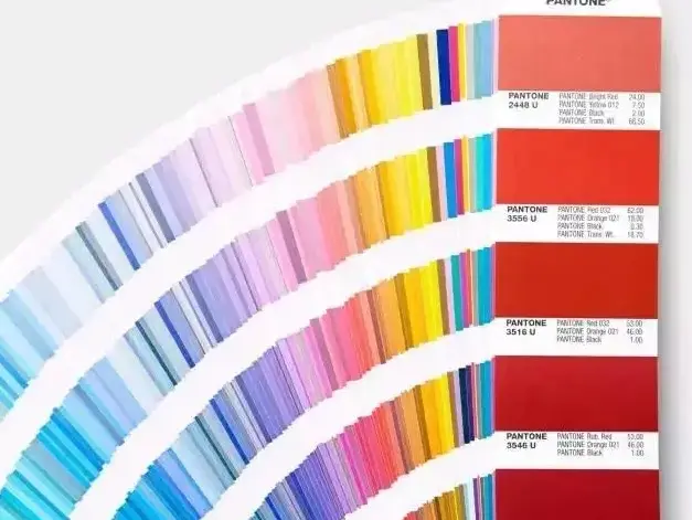
- The Pantone Solution: If a specific brand color is non-negotiable (e.g., Coca-Cola Red), do not rely on CMYK. Use a Pantone (Spot Color). This tells us to mix a specific bucket of ink that matches the swatch book exactly, regardless of the screen display.
- The Hard Proof: Monitor calibration is helpful, but nothing beats a physical proof. If color is critical, always ask for a “wet proof” or at least a calibrated digital hard copy.
Conclusion
Great design is 50% creativity and 50% technical execution. By mastering files, paper, and color, you transform from a graphic designer into a print production expert.
Worried about your current project file? Upload your artwork for a free technical review.