Address
304 North Cardinal
St. Dorchester Center, MA 02124
Work Hours
Monday to Friday: 7AM - 7PM
Weekend: 10AM - 5PM
Address
304 North Cardinal
St. Dorchester Center, MA 02124
Work Hours
Monday to Friday: 7AM - 7PM
Weekend: 10AM - 5PM
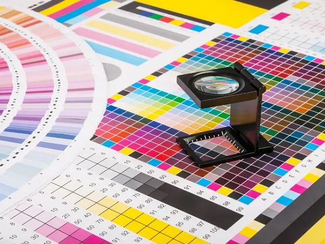
One of the most frustrating moments in printing is receiving a final product that doesn’t match the sample. You approved the proof, but the box looks “dull,” or the logo looks “too warm.” Why does this happen?
Color is not magic; it is physics. However, it is influenced by many variables, from the paper stock to the light bulb in your office. Based on our experience at Kore Create, here are the 7 critical factors that influence printing color quality—and what you can do to ensure consistency.
Color is subjective. To ensure consistency, the client and the printer must look at the proof under the same conditions.
Have you ever matched two socks in the bedroom, only to find they are different shades of black when you step outside? This is called Metamerism.
The colors surrounding the print affect how your eye perceives the print itself. This is called “Simultaneous Contrast.” If you hold a red print against a green wall, the red will appear different than if held against a white wall.
You cannot print the same color on two different papers and expect them to look the same.
Learn more about this in our guide to Art Paper vs. Wood-free Paper.
Spot Colors (Pantone) use a specific pre-mixed ink (like mixing paint in a bucket). Process Colors (CMYK) use dots of Cyan, Magenta, Yellow, and Black to trick the eye.
Your computer screen (RGB) creates color with light. The printing press (CMYK) creates color with ink.
Words like “make it pop,” “too warm,” or “a bit muddy” are vague.
Modern offset printing is based on the subtractive color model using Cyan (C), Magenta (M), Yellow (Y), and Black (K).
While C, M, and Y can theoretically mix to create black, in reality, they create a muddy brown. That is why we add “K” (Key/Black) to add depth, contrast, and crisp text. On the press, these four inks are printed as tiny dots at different angles. Your eye blends them together to see a full-color image.
Perfect color is a collaboration between the designer, the client, and the printer. By controlling these 7 factors, we can minimize variables and deliver a predictable, high-quality result.
Need a printer who understands color science? Contact Kore Create for a color consultation.