Address
304 North Cardinal
St. Dorchester Center, MA 02124
Work Hours
Monday to Friday: 7AM - 7PM
Weekend: 10AM - 5PM
Address
304 North Cardinal
St. Dorchester Center, MA 02124
Work Hours
Monday to Friday: 7AM - 7PM
Weekend: 10AM - 5PM
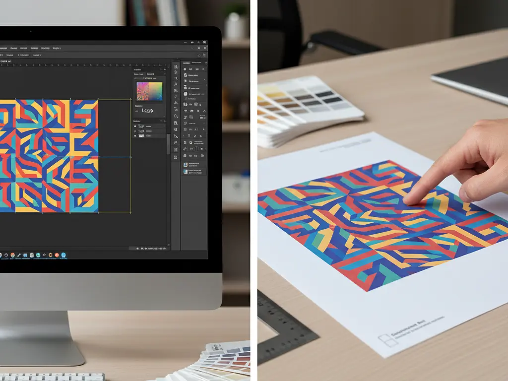
We see it often: a digital design looks stunning on a Retina display, but the final printed product looks disappointing. Colors are muddy, images are blurry, or important text gets cut off.
Conversely, some designs look simple on screen but turn out magnificent in print. What’s the difference? Print Knowledge.
A great designer understands that the screen is just a preview; the press is the reality. To help you bridge the gap between digital creativity and physical production, here is the essential guide to preparing print-ready files.
Many designers default to standard A4 (210x297mm) for brochures. However, in professional offset printing, we often recommend the “Large 16K” size (210x285mm).
Why? It’s about cost and waste. Printing presses use massive sheets of paper. The 210x285mm size fits perfectly onto these standard sheets with minimal waste. Forcing a 297mm height often means fewer pages per sheet and significant paper waste, which drives up your printing costs unnecessarily.
Rule of Thumb: Check the standard “finished size” with your printer before you start designing.
Resolution is the number of pixels within a physical space. It is the most common cause of blurry prints.
Tip: If you are using vector software like Illustrator, you don’t need to worry about resolution until you export photos or effects.
Bleed is the area of your design that extends beyond the final cut line. Paper cutting machines are precise, but not perfect. If you don’t add bleed, you risk having ugly white slivers on the edge of your brochure.
Standard Requirement: Add 3mm of bleed on all four sides. Keep all critical text and logos at least 3-5mm inside the trim line (Safe Zone). If you forget this, our pre-press team will try to fix it, but it’s always best to design it right from the start.
Screens emit light (RGB: Red, Green, Blue). Paper reflects light (CMYK: Cyan, Magenta, Yellow, Black).
Before you send your file to Kore Create, run this quick audit:
Good design is more than just aesthetics; it’s about technical execution. By following these standards, you ensure that the final product matches your vision.
Have a design ready? Send us your file for a complimentary technical check.